

Key Takeaways
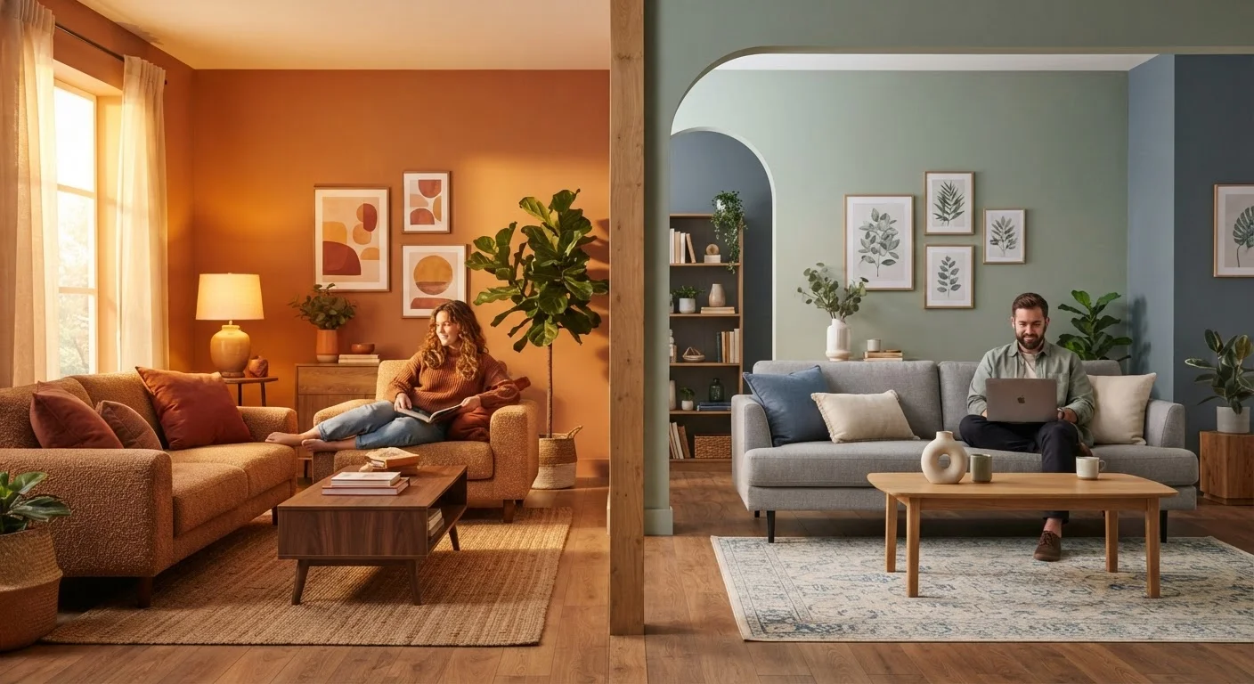
Option A
Warm-Toned Paint
The cozy, energizing choice that makes spaces feel intimate and lively.
Best for: Rooms where you want comfort, social energy, and a sense of closeness - such as living rooms, dining rooms, and home offices.
Option B
Cool-Toned Paint
The calm, airy alternative that makes rooms feel spacious and serene.
Best for: Spaces meant for rest, focus, or visual expansion - including bedrooms, bathrooms, and smaller rooms that need to feel larger.
If you want a welcoming, energetic dining or living room
Warm-Toned Paint
Warm hues stimulate conversation and appetite, making them a natural fit for shared social spaces.
If you want a restful bedroom or bathroom that feels like a retreat
Cool-Toned Paint
Cool blues and greens lower visual tension and support relaxation, promoting a calm atmosphere for rest.
If your room has little natural light or north-facing windows
Warm-Toned Paint
Warm tones compensate for the blue-grey cast of indirect light, preventing the space from feeling flat or cold.
If you have a small room you'd like to feel more open
Cool-Toned Paint
Cool, light-value colors recede visually, creating the perception of more space without any structural changes.
If your room receives strong afternoon sun and feels overheated
Cool-Toned Paint
Cool tones visually offset harsh south- or west-facing sunlight, making an already bright room feel balanced rather than glaring.
What Makes a Paint Color Warm or Cool?
Every paint color sits on a spectrum between warm and cool, determined by the hues and undertones it contains. Warm tones draw from the red, orange, and yellow side of the color wheel. They include terracotta, mustard, burnt sienna, coral, and even warm whites with creamy or peachy undertones. Cool tones pull from blue, green, and violet families - think slate, sage, powder blue, lavender, and cool whites with grey or bluish undertones.
The distinction becomes more nuanced with neutrals. A beige can be warm (yellow or pink undertone) or cool (grey or green undertone). A greige that looks balanced in the paint store can read strongly warm or cool once applied to your walls under your specific light. This is why testing samples in context is non-negotiable.
Understanding tone also means understanding value (lightness vs. darkness) and saturation (intensity). A deeply saturated warm rust behaves very differently from a pale blush - both are warm, but one is dramatic and space-shrinking while the other feels open and soft. See our guide on color drenching vs. neutral bases for how saturation choices shape an entire room's feel.
How Each Tone Affects Mood, Space, and Light
Warm and cool colors produce measurably different psychological and spatial effects - a principle rooted in color psychology research and widely applied in interior design practice.
Warm tones advance. They appear to move toward the viewer, which makes walls feel closer. This is an asset in large, cavernous rooms where you want to create intimacy, but a drawback in already small spaces. Warm colors also tend to stimulate energy and appetite, which is why terracottas, deep yellows, and earthy reds work well in dining rooms and kitchens.
Cool tones recede. They appear to push walls back, which optically expands a space. Cool hues also lower arousal levels - genuinely useful for bedrooms and bathrooms where the goal is rest or unwinding. Blues and greens are consistently rated as calming in color psychology studies.
| Criterion | Warm-Toned Paint | Cool-Toned Paint |
|---|---|---|
| Visual effect on space | Makes rooms feel smaller, cozier | Makes rooms feel larger, more open |
| Mood impact | Energizing, stimulating, inviting | Calming, serene, focused |
| Best room types | Living, dining, kitchen, office | Bedroom, bathroom, small rooms |
| Works best with light | North-facing or low natural light | South- or west-facing bright rooms |
| Common hues | Terracotta, ochre, cream, blush | Slate, sage, powder blue, lavender |
| Risk if overdone | Can feel enclosed or overstimulating | Can feel cold or clinical |
Light plays a compounding role. The direction your windows face changes which undertones your room's light emphasizes throughout the day. North-facing rooms receive indirect, bluish light year-round - adding cool paint can amplify a flat, chilly feeling. South-facing rooms get warm, direct sunlight for most of the day, making cool tones a useful counterbalance. East-facing rooms have warm morning light that fades to neutral by afternoon; west-facing rooms have cool mornings but intensely warm afternoon light. See our article on using color to brighten dark rooms for strategies that account for these differences.
Room-by-Room Recommendations
There's no universal rule, but certain tone choices are well-supported by how rooms are used and lit.
Undertones Matter More Than You Think
A paint labeled 'white' or 'grey' is rarely neutral - it almost always carries a warm or cool undertone. Hold a true white card next to your sample: if the paint looks yellow, pink, or beige beside it, it's warm; if it looks blue, green, or purple, it's cool. This comparison is one of the most reliable ways to identify undertone before committing to a full gallon.
Living Rooms and Dining Rooms
These social spaces benefit from warm tones that invite conversation and feel welcoming. Earthy ochres, warm taupes, terracottas, and deep reds work especially well. If the room is large, a warm saturated tone on one wall can anchor the space - for guidance on that approach, see when accent walls help and when they don't.
Bedrooms
Cool and muted tones support rest. Soft blues, dusty greens, and lavenders are proven choices. Warm tones can work in bedrooms when kept low in saturation - a warm blush reads restful rather than stimulating. Avoid high-saturation warm colors in rooms where you sleep.
Kitchens
Kitchens handle both tasks - food prep and socializing - so a warm mid-tone (soft sage, warm white, muted yellow) often works well. Avoid very dark warm tones that absorb light in an already busy workspace.
Bathrooms
Small bathrooms benefit from cool, high-value (light) tones that read fresh and airy. Larger bathrooms can handle deeper cool tones like dusty teal or slate without feeling enclosed.
Home Offices
Studies on workplace color suggest that moderate warm tones (muted terracotta, warm taupe) support sustained focus without causing fatigue, while very cool or very saturated colors can be either overstimulating or draining over long hours.
Testing and Choosing With Confidence
The biggest mistake homeowners make is choosing paint from small chips under store fluorescent lighting. Paint chips are useful for narrowing options, but they cannot substitute for seeing a color on your actual walls.
Paint at least two 12-by-12-inch samples of your candidate colors directly on the wall. Observe them at different times of day - morning, midday, and evening under artificial light. If a color looks right in all three conditions, it's a strong candidate. If it shifts uncomfortably (a warm beige going greenish at night, or a grey turning lavender in afternoon sun), trust what you see rather than the chip.
Also consider what's already fixed in the room: flooring, cabinetry, and large furniture pieces all have undertones of their own. A warm honey-oak floor will clash with a strongly cool grey wall. A cool grey marble countertop will fight a red-orange kitchen. Your paint should harmonize with these fixed elements, not compete with them.
Pair your tone selection with a thoughtful layered lighting plan - bulb temperature (warm vs. cool white) interacts directly with paint tone and can shift its appearance dramatically. Similarly, texture and material choices amplify or soften your chosen palette in ways that flat photographs rarely capture.
90%
Of snap judgments about products attributed to color alone
Research published in the journal Management Decision suggests color accounts for up to 90% of initial product impressions, highlighting how powerfully color shapes perception in any environment.
2-3 days
Recommended sample observation period before committing
Interior design professionals broadly advise observing paint samples across at least two to three days to capture how shifting natural and artificial light alters a color's appearance.