

Key Takeaways
Our Verdict
Color drenching and neutral base decorating represent genuinely opposite philosophies, and both can produce stunning results when matched to the right space. Color drenching rewards bold commitment and rewards rooms that have strong bones. A neutral base is the more forgiving, adaptable system - especially valuable when tastes or circumstances change.
| Best for | Recommended |
|---|---|
| Those who want a dramatic, designer-level transformation with one decision | Color Drenching |
| Renters, frequent redecorators, or those who share decorating decisions | Neutral Base |
| Rooms with low or uneven natural light | Neutral Base |
| Small rooms where you want to hide awkward angles or architectural interruptions | Color Drenching |
What Each Approach Actually Means
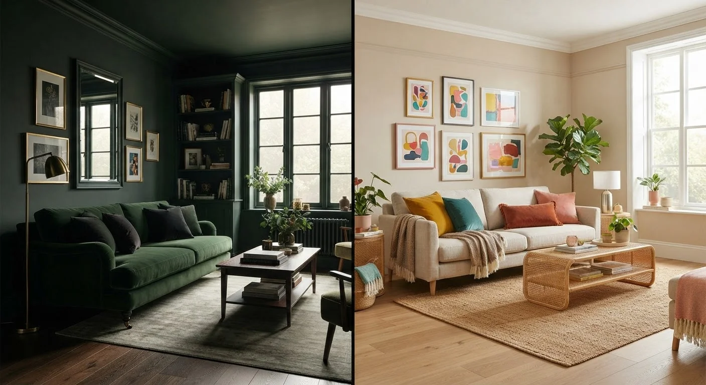
Color drenching means painting a room's walls, ceiling, trim, and sometimes even built-ins in the same color - or closely related shades of it. The goal is total immersion. By eliminating the visual break that white trim and a white ceiling create, the eye reads the room as one continuous color field. The effect can feel cocooning, sophisticated, or dramatically moody depending on the hue chosen.
Neutral base decorating takes the opposite route. Walls and architectural details are kept in low-chroma tones - warm whites, soft greiges, light taupes - so that furniture, textiles, artwork, and plants carry the color story. The shell stays quiet; the contents do the talking.
Both approaches differ from the more familiar accent wall strategy. If you're curious how accent walls compare structurally, see when accent walls help and when they hurt the room for a useful contrast.
How Each Approach Affects the Feel of a Room
Color drenching makes a room feel smaller but more intentional. Counterintuitively, this can work in a small room's favor - a powder room or reading nook drenched in a deep color often reads as jewel-box luxurious rather than cramped. It also softens awkward transitions: when trim and ceiling match the walls, interrupted angles and low ceilings become less noticeable.
A neutral base, by contrast, tends to read as larger, airier, and more flexible. Light bounces off pale walls more predictably, making it easier to use mirrors and lighting to stretch perceived space. For guidance on that interaction, see making a dark room feel brighter.
Color also interacts with light quality in ways that amplify whichever approach you choose. Warm afternoon light flatters earthy drench colors - terracottas, ochres, dusty olives. Cool north-facing light can make the same colors look dingy. Understanding warm-toned vs. cool-toned paint is essential groundwork before committing to either strategy.
| Color Drenching | Neutral Base | |
|---|---|---|
| Commitment level | High - full room repaint to reverse | Low - swap accents anytime |
| Best room size | Small to medium rooms benefit most | Works well at any size |
| Light sensitivity | High - light quality dramatically shifts results | Moderate - pale tones more forgiving |
| Renter-friendly | Less practical - large repaint to restore | Very practical - minimal wall changes needed |
| Design skill required | Low - one decision drives the whole look | Moderate - layering accents takes editing |
| Cost to execute | Slightly more paint; fewer accessories needed | Less paint; more spent on furnishings and decor |
Practical Execution: What Each Approach Requires
Color drenching demands more paint - typically an extra quart to half-gallon per room to cover trim and ceiling - and a higher tolerance for commitment. Mistakes are harder to partially correct; if the color reads wrong once it's on every surface, you're repainting the whole room, not just one wall. Always test a large sample (at least 12×12 inches) on multiple surfaces and observe it across morning, afternoon, and evening light before buying full quantities.
A neutral base requires less upfront decisiveness about color, but it shifts the creative burden to furnishings and accessories. A flat, bare neutral room without layered texture, varied materials, and considered accent color can feel sterile rather than calm. Texture in interior design becomes especially important here - linen, wood grain, woven baskets, and matte ceramics give the neutral shell warmth and dimension without introducing competing colors.
Lighting matters enormously in both approaches. In a drenched room, inadequate lighting can make the color feel oppressive. In a neutral room, flat overhead light removes the depth that makes a carefully layered space come alive. For guidance, see lighting layers: ambient, task, and accent light.
Test Your Color in Multiple Conditions
Before committing to a drench color, paint a large swatch on the wall and observe it at different times of day and under your room's artificial lighting. Colors shift noticeably from morning to evening and under warm versus cool bulbs. This one step prevents the most common and costly mistake in color drenching.
Which Approach Fits Your Situation
Choose color drenching if you own your home, feel confident in a specific color, and want a high-impact result with relatively low effort compared to a full renovation. It suits people who redecorate infrequently and prefer a strongly defined aesthetic.
Choose a neutral base if you rent, share decorating decisions with others, change your style often, or are furnishing a room incrementally over time. A neutral shell lets you rotate accent colors seasonally without repainting. It also performs more reliably across a wider range of natural light conditions.
Neither approach is inherently superior. A drenched room done thoughtfully can feel far more alive than a neutral room that was never properly accessorized. And a well-layered neutral room can have more visual richness than a drenched room where the color was chosen hastily. The deciding factor is usually your confidence in the color and your willingness - and ability - to commit to it long-term.