
Texture in Interior Design: The Overlooked Element That Makes Rooms Feel Finished

Key Takeaways
Texture in Interior Design
Texture refers to the surface quality of materials in a room - how they look and feel, whether rough or smooth, soft or hard, matte or glossy. It includes both tactile texture (what you can physically feel) and visual texture (the impression of surface variation created by pattern or color). Layering different textures is what makes a space feel rich, complete, and interesting rather than flat or sterile.
Designers distinguish between 'actual texture' (physically felt surface qualities) and 'implied texture' (visual surface quality suggested by print, weave pattern, or finish). Both influence how a room reads.
Why Texture Does What Color Alone Cannot
Most homeowners spend considerable energy choosing paint colors, only to find the finished room still feels like something is missing. The culprit is almost always texture. Color sets mood and palette; texture creates dimension, warmth, and the sense that a room has been thoughtfully assembled rather than simply furnished.
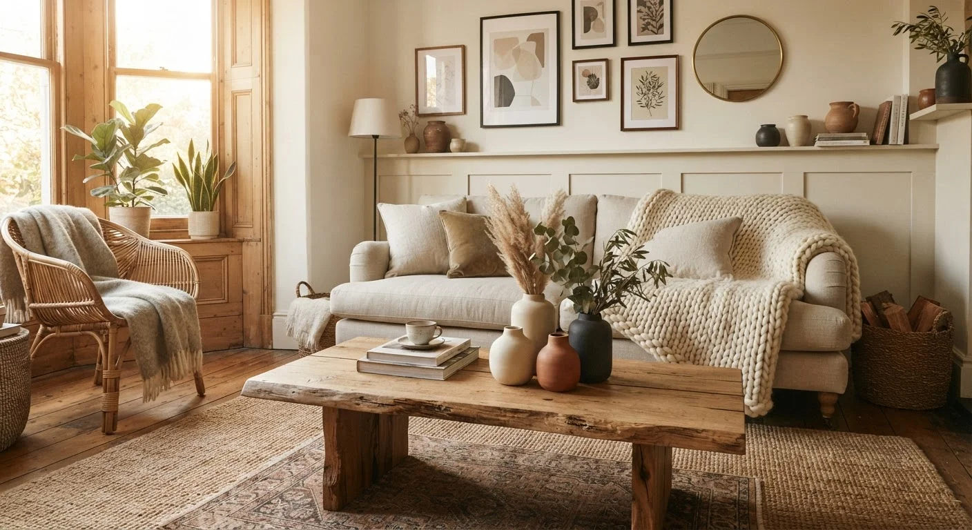
Think of two rooms painted the same warm white. In one, every surface is flat - smooth drywall, laminate floors, plastic light fixtures. In the other, a linen sofa sits on a jute rug beneath a whitewashed wood ceiling beam. Both rooms share an identical color scheme, but only the second one feels finished. The difference is entirely texture.
This is especially true in neutral-palette rooms, where texture must carry the visual interest that bold color would otherwise provide. If you're exploring how your paint choices interact with the overall feel of a space, the guide to warm- and cool-toned paint explains how tone sets the foundation that texture then builds on.
65%
Homeowners who say comfort drives design decisions
According to a Houzz survey on home design priorities, a majority of respondents ranked comfort and livability above aesthetics - and texture is central to how comfort is perceived visually and physically.
3-5
Texture types recommended per room
Interior design educators generally advise layering between three and five distinct textures per room to achieve depth without visual clutter.
Tactile vs. Visual Texture: Understanding the Difference
Interior designers work with two distinct types of texture, and understanding both opens up far more possibilities for your rooms.
- Tactile texture is physical - the nap of a velvet cushion, the grain of an oak tabletop, the roughness of a brick wall. It engages the sense of touch and gives a room genuine material richness.
- Visual texture is implied - the appearance of surface variation created by pattern, weave, or sheen. A printed linen fabric, a textured wallpaper, or a matte-finish ceramic tile all suggest texture even when the surface itself is relatively smooth.
Both types contribute to how a room reads at a glance. Visual texture is particularly valuable on walls and ceilings, where adding physical materials may be impractical. A subtly textured wallpaper in a hallway, for instance, adds depth that flat paint simply cannot replicate.
How to Layer Textures Without Creating Chaos
The goal of layering texture is contrast, not competition. Too much contrast with no unifying thread creates visual noise; too little contrast produces a flat, undifferentiated look. Here's a practical framework:
- Establish a dominant texture. Choose one material that will appear most prominently - a linen sofa, hardwood flooring, or a stone fireplace surround. This becomes the room's textural anchor.
- Add a secondary texture that contrasts. If your anchor is smooth and soft (linen), introduce something rough and natural (a jute rug, a wicker pendant shade, a raw wood side table).
- Layer two or three accent textures. These appear in smaller doses - ceramic vases, a knit throw, a velvet pillow, a polished metal lamp base. Each adds a note without dominating.
- Unify through color. Keep the color palette consistent while the textures vary. This is what prevents a layered room from reading as chaotic.
This approach works across every design style, from Scandinavian minimalism to relaxed coastal - you can explore how texture fits within broader stylistic frameworks in the Interior Design Styles Decoded guide.
Start With What You Already Own
Before purchasing anything new, walk through your rooms and identify surfaces that are all the same finish. Swapping one pillow for a textured alternative, repositioning a woven basket, or folding a throw differently costs nothing and immediately tests whether adding contrast improves the feel of the space. Small experiments reveal a lot before you commit to larger changes.
Material Choices: What Each Texture Contributes
Different materials do different jobs in a room's textural mix. A rough-hewn wooden element grounds a space and adds warmth. Stone and ceramic introduce coolness and solidity. Soft textiles - linen, cotton, wool, velvet - add comfort and absorb sound, making rooms feel more intimate. Glass and metal bring lightness and reflectivity, preventing a heavily textured room from feeling heavy.
Lighting interacts directly with texture: raking light from a side table lamp or low pendant will cast shadows that emphasize surface variation, making even subtle textures visible. A room that looks flat under overhead lighting often reveals unexpected depth when lit from the side. This is worth considering alongside how you layer your ambient, task, and accent lighting.
Proportion also matters. A very large room needs textures with more visual weight - thick rugs, chunky knits, substantial wood furniture - to avoid feeling sparse. In a smaller room, finer textures tend to feel less overwhelming. For more on how size and proportion affect design decisions, the explainer on design scale is a useful companion read.
Common Texture Mistakes - and How to Avoid Them
A few missteps show up repeatedly in home interiors that feel almost-but-not-quite finished:
- All-soft or all-hard surfaces. A room filled entirely with upholstered furniture and soft textiles can feel shapeless. A room of glass, metal, and lacquered wood can feel cold. The solution is always contrast.
- Ignoring the floor. The floor is one of the largest surfaces in any room, and a bare hardwood or tile floor with no rug is a missed textural opportunity. Even a simple flat-woven rug introduces a layer of visual and tactile texture.
- Matching finishes too closely. The instinct to match - all matte or all glossy - removes the contrast that makes individual materials read. A matte ceramic bowl next to a glossy glass vase is more interesting than two items of identical sheen.
- Overlooking walls. Walls are rarely just backdrop. Textured plaster, shiplap, board-and-batten, or even a subtly textured paint technique can add significant depth. If a feature wall approach appeals, the guidance on accent walls can help you decide when that's the right call.
Approaching texture intentionally - rather than defaulting to matching surfaces throughout - is one of the most accessible ways to elevate a room without changing its layout or making major investments.