

Key Takeaways
Why Decorating Myths Stick Around
Interior design advice travels fast - through social media, home improvement shows, and well-meaning friends - and some of it has hardened into "rules" that few people stop to question. The problem is that many of these rules are either oversimplified, outdated, or just plain wrong. Following them uncritically can leave a room feeling stiff, uncomfortable, or visually dull.
This guide examines the most common decorating myths homeowners encounter, explains why they persist, and replaces them with practical, reasoned guidance. For a broader grounding in how design concepts actually work, our Interior Design Styles Decoded guide is a useful companion reference.
Myth
Small rooms need small furniture - oversized pieces will overwhelm the space.
Fact
A few well-scaled, larger pieces typically make a small room feel more intentional and less cluttered than many small ones.
Cramming a small room with petite furniture creates visual noise and makes the space feel busy rather than spacious. A single sofa of appropriate depth, for example, anchors the room and leaves breathing space around it. Furniture that is too small for the room can actually emphasize how little space there is by leaving awkward gaps and failing to create a clear focal point.
The real principle at work is proportion, not absolute size. A piece of furniture should relate sensibly to the room's dimensions and to the other pieces around it - not simply be small because the room is small.
Myth
Matching furniture sets are the safest decorating choice.
Fact
Perfectly matched sets often produce flat, showroom-like rooms; mixing pieces intentionally creates far more visual interest.
Furniture suites - where every piece shares the same finish, fabric, and silhouette - eliminate the tension and contrast that make a room engaging. Professional designers regularly mix wood tones, materials, and eras to create rooms that feel collected and personal rather than catalog-perfect.
A practical starting point: choose pieces that share one unifying element (a color family, a material like natural wood, or a general style era) while varying in other ways. This creates cohesion without monotony. Our guide on shared living spaces covers how to blend different tastes using similar principles.
Myth
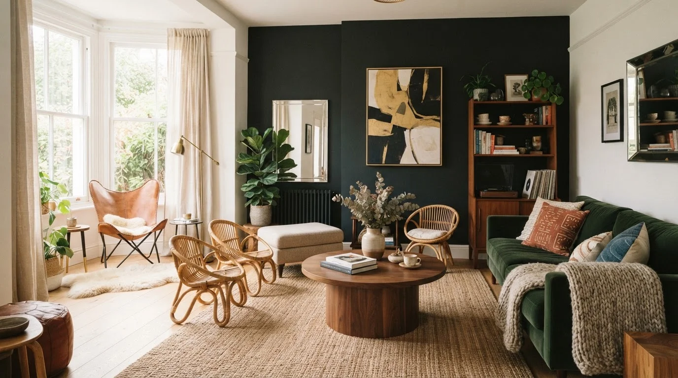
Dark paint colors make a small room feel even smaller.
Fact
Dark colors can make a small room feel cozy, dramatic, and intentional - in many cases more so than white or pale paint.
Light colors can actually make architectural flaws - uneven walls, awkward proportions, mismatched trim - more visible by reflecting attention toward them. A dark wall, by contrast, recedes and creates a sense of depth. Rooms painted in deep navy, forest green, or charcoal frequently photograph as larger than they are because shadows and edges are less defined.
The key variable is lighting. A dark room with poor natural light and no layered artificial lighting will feel gloomy regardless of paint color. Addressing light sources first - then choosing paint - produces more consistent results. Understanding when accent walls help or hurt is also relevant here.
Myth
White is always a safe, neutral paint choice.
Fact
White paint has strong undertones - pink, yellow, blue, or green - that interact unpredictably with a room's light and furnishings.
There are hundreds of whites on the market, and they behave very differently depending on a room's orientation, the color of adjacent surfaces, and the warmth of the light sources inside. A white that looks crisp and clean in a north-facing showroom can appear distinctly lavender or yellow-green in a south-facing bedroom with warm afternoon light.
Testing paint swatches on the actual wall - not on a chip held up to the room - and observing them at morning, midday, and evening is the only reliable approach. White is not a default that skips this step; it requires the same testing process as any other color.
Myth
Rugs should float in the center of a seating arrangement, touching nothing.
Fact
A rug that is too small for the furniture grouping is one of the most common decorating mistakes - furniture legs should typically rest on it.
A small rug isolated in the middle of a seating group looks like an afterthought and fragments the visual space. Design guidance generally recommends that in a living room, at minimum the front two legs of every seating piece should rest on the rug. This visually anchors the grouping and defines the conversation area as a unified zone.
When in doubt, go larger. An oversize rug that grounds the whole room is almost always more successful than one that leaves furniture floating around its edges.
Myth
Art should be hung as high as possible to draw the eye upward.
Fact
Art hung too high is the most frequent hanging mistake - the standard guideline centers the piece at roughly 57 to 60 inches from the floor.
Hanging art high can feel disconnected from the furniture and human activity below it, making the walls look oddly proportioned. The 57-to-60-inch center guideline reflects average human eye level and is used by many galleries and museums as a baseline. Art placed at this height relates naturally to the people in the room and to the furniture beneath it.
Exceptions apply: art hung above a sofa or headboard should generally sit 6 to 12 inches above the furniture top, keeping it connected to that anchor piece rather than floating in isolation. For detailed guidance, see our comprehensive art-hanging reference.
Putting the Myths to Work: Practical Takeaways
Correcting a myth is only useful if the replacement guidance is actionable. Here are the most direct ways to apply what the myth-busting above reveals:
- In a small room: Choose one or two larger anchor pieces rather than filling every corner with small furniture. Negative space is a design tool, not wasted real estate. Our guide to arranging furniture in tight spaces walks through this step by step.
- When choosing a rug: Measure first. In a living room, a rug that fits only under the coffee table is almost always too small. Aim to have at least the front legs of every seating piece on the rug.
- With paint color: Test large swatches (at least 12 inches square) on the actual wall and observe them at different times of day before committing. For rooms that feel dim, strategic color and mirror placement can brighten the space without renovation.
- When decorating walls: Hang art at eye level - roughly 57 to 60 inches from floor to center of the piece - rather than following ceiling height. See our full art-hanging guide for grouping and hardware advice.
57-60"
Recommended art center height from floor
This range reflects average standing eye level and is the baseline used by many professional galleries and interior designers.
2 legs minimum
Furniture legs that should rest on a living room rug
Design professionals widely recommend at least the front legs of all seating pieces rest on the rug to visually anchor a grouping.
Understanding what design scale really means and how layering texture finishes a room will take you further than any single decorating rule ever could.
Rules Are Starting Points, Not Requirements
Every guideline in interior design - including the corrections in this article - is a starting point, not a mandate. Proportion, light, and personal preference all shift what works in a specific room. The goal is to understand why a principle exists so you can decide when to follow it and when to break it deliberately. A room that reflects how you actually live will always outperform one that follows rules rigidly.