

Key Takeaways
The Golden Rule: Hanging Art at the Right Height
The most universal guideline in art hanging comes from the museum world: position the center of the artwork at eye level, typically 57-60 inches from the floor. This range reflects average adult standing eye height and prevents art from floating too high or feeling cramped near the baseboard.
To apply this in practice, measure 58 inches from the floor and make a light pencil mark. That mark is your target center point. From there, account for the specific hardware on the back of the frame. Measure from the frame's top edge down to where the wire or hook will actually catch - subtract that number from half the frame's total height, and you'll know exactly where to place your nail.
When art hangs above furniture - a sofa, a headboard, a console table - the calculus shifts slightly. Art should sit 6-8 inches above the top of the furniture, not floating high on the wall as if unrelated to what's below. This visual anchoring is one of the most common corrections interior designers make in everyday homes. If you're rethinking your entire layout, our guide to arranging furniture in tight spaces explains how art placement interacts with furniture scale and flow.
When hanging a piece above a bed, resist going higher than 8 inches above the headboard - even if the ceiling is tall. Visual breathing room above art looks intentional; excessive distance just looks forgotten.
Interior designers consistently cite the bed-to-art gap as an area where homeowners misjudge scale, and the 6-8 inch rule keeps art in the 'furniture zone' rather than the 'ceiling zone.'
Use a level on every hang, even when your eye tells you it's straight. Walls and floors in older homes are rarely perfectly plumb, and a 'level-looking' hang confirmed by tool is always more reliable than perception.
Even a half-degree tilt is visible from across a room; a spirit level or digital level app takes seconds and eliminates a surprisingly common rework scenario.
Choosing the Right Hardware for Your Wall Type
The hardware you choose depends entirely on what's behind the drywall - or whether you have drywall at all. Using the wrong anchor is the primary cause of fallen art and damaged walls.
- Standard drywall: For frames under 20 lbs, an angled picture hook with a hardened nail is usually sufficient. For heavier pieces, use a wall anchor rated for the weight, or - better yet - locate a stud using a stud finder and drive a screw directly into it.
- Plaster walls: Common in homes built before the 1950s, plaster is brittle and cracks easily. Use plastic expansion anchors drilled with a masonry bit, and work slowly to avoid crumbling.
- Masonry and brick: Requires a masonry drill bit and appropriate anchors. This is not a standard picture hook situation - take the time to use the right equipment or consult a professional.
Always check the weight rating printed on your hardware packaging and compare it to your frame's actual weight. When in doubt, go heavier-rated than you think you need.
Don't Guess on Older Wall Construction
Homes built before the 1960s may have plaster over wood lath rather than standard drywall, and the two require very different fasteners. Driving a standard picture hook nail into plaster often causes cracking and crumbling. If you're unsure of your wall type, probe a small area in an inconspicuous spot or consult a contractor before hanging heavy pieces.
Spacing and Grouping: Gallery Walls Done Right
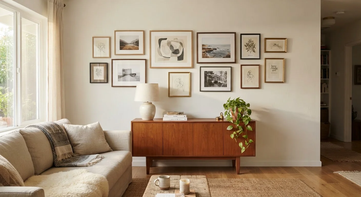
A gallery wall can look intentional and curated, or chaotic and haphazard - the difference usually comes down to consistent spacing and a unifying element. Start by choosing at least one thing all the pieces share: frame color, mat style, subject matter, or a dominant palette.
The most dependable approach to spacing is 2-3 inches between frames throughout the arrangement. Tighter than 2 inches feels cluttered; more than 4 inches and the grouping starts to lose coherence. Use a tape measure, not your eye, until you've developed instincts for it.
Before touching a nail, trace each frame onto kraft paper, cut out the templates, and tape them to the wall with painter's tape. Step back and evaluate from across the room. Adjust until the arrangement feels balanced, then mark through the paper where each hook will go. This method eliminates guesswork and prevents unnecessary holes.
For a salon-style gallery (floor-to-ceiling, densely packed), start with the largest anchor piece at eye level and build outward. For a more restrained horizontal arrangement, align tops or centers of frames along a consistent invisible line rather than mixing both.
It's also worth revisiting common decorating myths, including the assumption that all frames in a grouping must match - mixing frame profiles can look sophisticated when the sizes and spacing are handled with care.
Sizing Art to the Room and Furniture
Undersized art is one of the most frequent decorating missteps. A small print centered on a large empty wall will look timid rather than intentional. As a working rule, a single piece of art above a sofa should span two-thirds of the sofa's width. For a 90-inch sofa, that means looking for a piece or grouping that lands around 60 inches wide.
57-60"
Standard art center height from floor
This range is widely used by professional art installers and museum curators to match average adult eye level.
2-3"
Recommended spacing between frames in a gallery
Interior design guidelines consistently identify this range as the threshold between a cohesive grouping and a cluttered or disconnected one.
⅔
Art width relative to sofa width
A widely cited proportion guideline that prevents undersized art from looking adrift above large furniture pieces.
In dining rooms, art hung above a buffet or sideboard follows similar logic - it should anchor the furniture rather than appear to have drifted there. Over a fireplace mantel, keep art proportional to the mantel width and avoid pieces so tall they intrude on ceiling trim or architectural molding.
If you're working with a bold feature wall nearby, consider reading about when accent walls help versus hurt a room - art placement and wall color work together, and conflicts between the two can undermine both.
Common Mistakes to Avoid
Even experienced decorators repeat a few persistent errors. Here's what to watch for:
- Hanging everything too high. This is the single most common mistake. When art drifts toward the ceiling, it disconnects from the rest of the room. Return to the 57-60 inch center-height rule.
- Ignoring the room's architecture. Art should respond to doors, windows, and trim lines - not compete with them. Avoid hanging pieces that a door will partially obscure when opened.
- Choosing hardware based on price, not load rating. A frame rated at 30 lbs needs a 30 lb-rated hook, not a lighter option that costs less.
- Skipping the layout step. Jumping straight to nailing wastes time and leaves unnecessary holes. The kraft paper method described above takes 20 minutes and saves hours of repair.
- Letting lighting be an afterthought. Art looks flat without proper light. Picture lights, adjustable track lighting, or angled recessed fixtures can make an enormous difference. If your current lighting layout is rigid, consider whether the placement choice accommodates what's already overhead.
The goal in every case is art that feels like it belongs - sized to the wall, anchored to the furniture, and lit well enough to actually be appreciated. Small adjustments in each of these areas compound into a room that reads as thoughtfully designed rather than randomly assembled. For more on how design choices interact at the room level, see what open shelving demands from a homeowner - many of the same principles of visual balance apply.